Helsinki Airport Gamification: Award-Winning UX Design
- Seven Awards That Are Really Seven Rounds of User Research
- What the ASQ Actually Measures, and Why It Matters
- The Experience: UX Designed at Every Touchpoint
- A Unified System, Not Separate Products
- The Digital Layer: End-to-End Journey Control
- The Methodology: How Gamification Drives Every UX Decision
- From Blueprint to Game Engine: BIM and Unity
- The Virtual Safari: Immersive Co-Design as User Research
- UX as a Financial Lever: What the Data Says
- Dwell Time: The Metric That Connects UX Quality to the Income Statement
- Three UX Principles Every Designer and CTO Can Apply
- The Helsinki Case as a Transfer Model for Digital Product Teams
- The Gap Between Infrastructure and Experience Is Measured in UX Decisions
- Gamification as a Design Tool, Not a Consumer Feature
How Helsinki Airport Won 7 ASQ Awards Through Gamification
Helsinki Airport didn’t win seven ASQ awards by accident — it used BIM, Unity 3D, and gamification mechanics to simulate and test every passenger touchpoint before a single change went live. The result: a 12.3% rise in non-aeronautical revenue and a passenger experience that consistently ranks among the world’s best. This post breaks down the design methodology and the three UX principles that transfer directly to any digital product team.
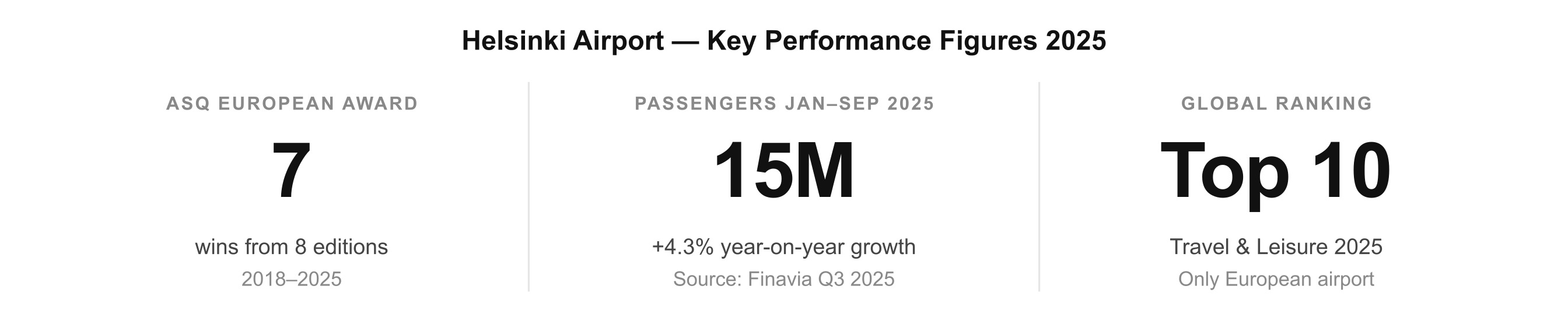
Helsinki Airport has won the European ASQ Award seven times in eight years. Not because its runways are longer or its lounges more luxurious; but because its design team made a choice that most large infrastructure projects never make, which was to treat the end user's experience as the primary design brief, and to test and validate it before a single wall was built.
This is not a story about an airport. It is a story about user experience design at scale: the gamification methodology that made it possible, and the measurable financial outcomes that followed.
Seven Awards That Are Really Seven Rounds of User Research
What the ASQ Actually Measures, and Why It Matters
Every year, the Airports Council International sends trained interviewers into 400 airports across 95 countries. They ask 4,000 passengers at each site to evaluate 30 different categories: wayfinding clarity, security speed, spatial comfort, staff courtesy, food and retail quality. Scoring at the top requires consistency across every touchpoint, with no weak links.
Seen from a UX perspective, seven ASQ awards are not a reputation metric; they are seven independent rounds of user research, each confirming that the design decisions embedded in Helsinki's physical and digital infrastructure are working. When 4,000 users per year, across seven consecutive years, rate an experience as best in class, that is validation at a scale most digital teams can only dream of.
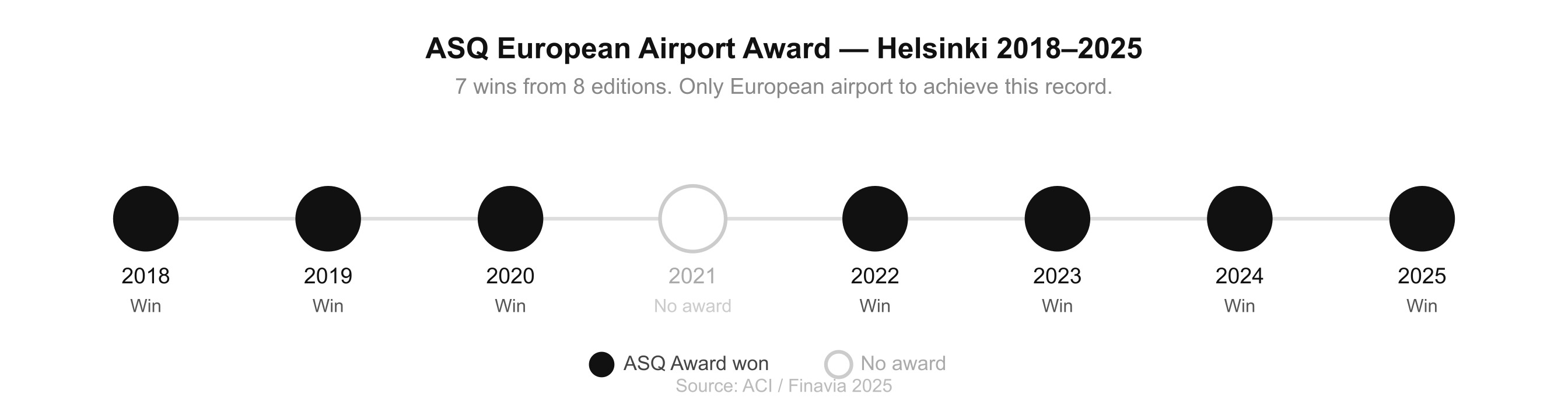
ASQ European Airport Award wins 2018–2025. Seven from eight editions; only 2021 unawarded.
The Experience: UX Designed at Every Touchpoint
A Unified System, Not Separate Products
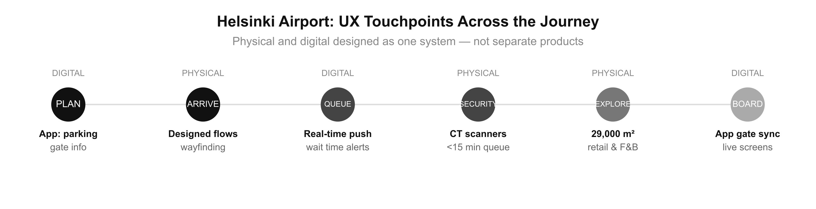
The output of Helsinki's design process is an experience that removes friction at every stage of the passenger journey, from opening the app at home to stepping onto the plane. Physical and digital touchpoints are not treated as separate products. They are parts of the same UX system, designed together and measured continuously.
The Digital Layer: End-to-End Journey Control
In partnership with Futurice, Finavia built an omnichannel digital ecosystem that connects every touchpoint of the passenger journey into a single coherent system. The mobile app delivers real-time gate information, push notifications for security wait times, parking booking, and turn-by-turn wayfinding. Behind the scenes, a microservice architecture synchronises the app, terminal information screens, and operational systems in real time, ensuring what the user sees on their phone matches what they see on the screen above the checkpoint.
Digital Feature
In-terminal wayfinding
Turn-by-turn navigation integrated into the app and synced with physical signage. Reduces cognitive load and decision anxiety at every junction.
Digital Feature
Real-time queue notifications
Push alerts for security and gate wait times. Passengers plan dwell time instead of managing anxiety, reducing perceived wait even when actual wait is unchanged.
Digital Feature
Omnichannel consistency
App, info screens, and operational systems share a single microservice backend. The information on your phone is identical to every screen in the terminal.
Digital Feature
Pre-trip integration
Parking booking, estimated walking times, and flight status accessible before arrival. The journey experience starts at home, not at the terminal entrance.
"When the app says your security queue is six minutes, and six minutes later you are through, you trust the system. That trust is not trivial; it is the psychological mechanism that allows a passenger to relax, explore, and spend."
The Methodology: How Gamification Drives Every UX Decision
From Blueprint to Game Engine: BIM and Unity
The experience described above did not emerge from intuition or convention. It was the product of a design methodology that Helsinki applied before a single wall was built: using game development technology to run user testing sessions on the physical space: identifying friction, validating flows, and iterating on the design before the cost of change became prohibitive. The gamification here is not on the passenger-facing screens; it is in the design process that produced what passengers experience.
Finavia has been a pioneer in Building Information Modeling since 2007. Architectural 3D models are converted into Unity, the same engine used to build modern video games. The output is a first-person navigable environment where actual passenger journeys are simulated with metric precision. Participants walk the space, experience it, and report what doesn't work.
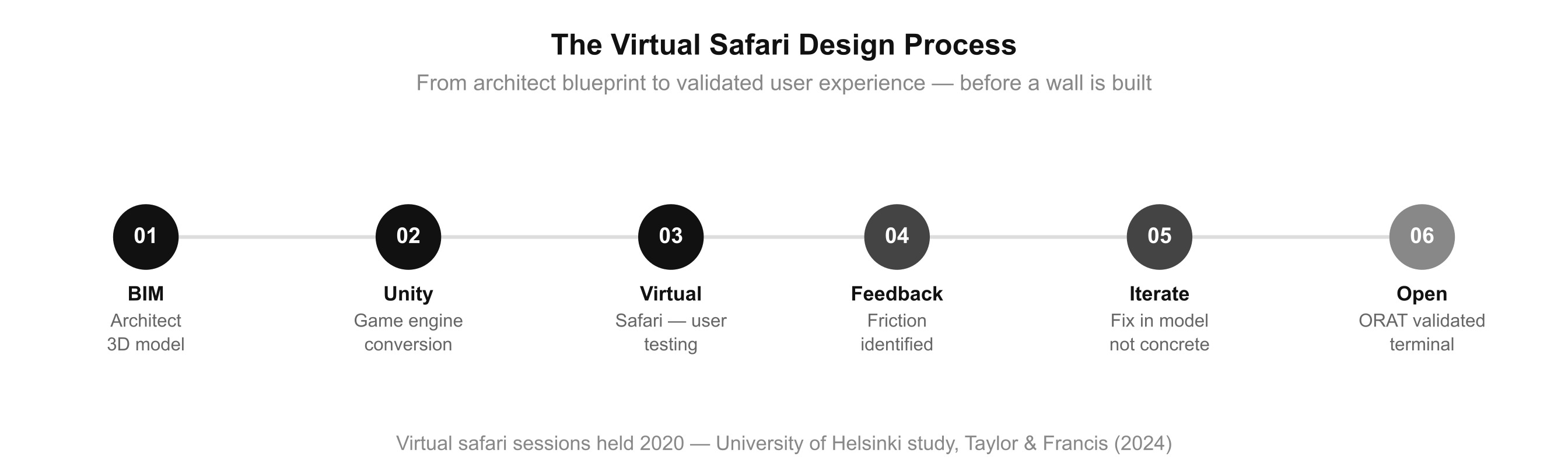
From BIM model to game engine to virtual safari to validated opening, all before concrete is poured.
The Virtual Safari: Immersive Co-Design as User Research
The most innovative phase is what Finavia calls the virtual safari, immersive sessions in which stakeholders with different roles walk through the virtual airport wearing 3D glasses, before the building physically exists. A University of Helsinki study (Taylor & Francis, 2024) analyzed three sessions held ahead of the 2021 terminal opening. The researchers concluded: the virtual format radically transformed feedback quality, enabling participants to co-design their own experience in a future space, instead of interpreting technical floor plans.
Preparation
Map the user journeys
The Unity model is configured with actual passenger flows: departure, arrival, transit. Each professional receives an itinerary reflecting their specific perspective, identical to how UX research defines personas before testing.
Session
Walk the experience
10–15 stakeholders explore the virtual airport wearing 3D glasses. The ORAT (Operational Readiness, Activation and Transition) process uses the model as the final UX validation step before physical opening.
Feedback
Real observations from lived experience
Each participant reports friction from their own point of view: unclear sightlines, awkward flows, positioning problems. Feedback is precise because the experience is first-person, not hypothetical.
Iteration
Fix before you build
Changes are made in the digital model before materials are ordered. The logic is identical to fixing a UX issue in a wireframe rather than in a shipped product: the cost difference is an order of magnitude.
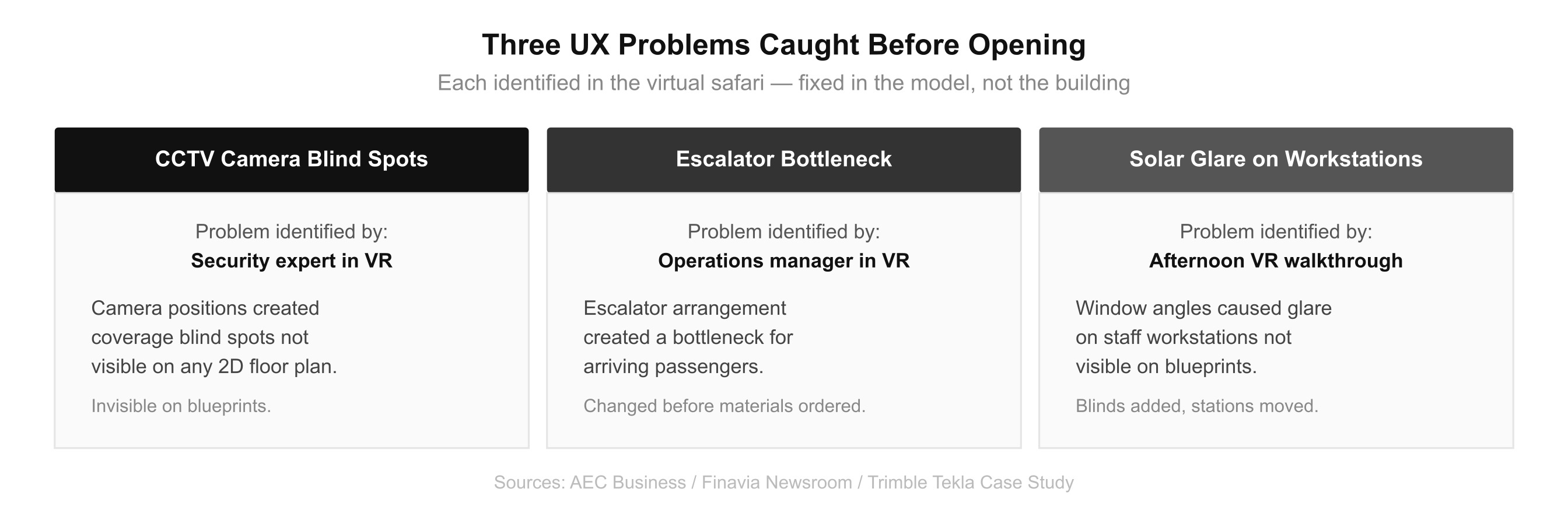
Three real issues, including camera blind spots, passenger flow bottlenecks, and solar glare, caught in VR and fixed before construction.
UX as a Financial Lever: What the Data Says
Dwell Time: The Metric That Connects UX Quality to the Income Statement
A CTO doesn't bring "the experience improved" to the board. They bring numbers. Dwell time is the bridge between user experience and financial performance; it measures behavior. A passenger who trusts the system, who knows the queue will be short, the gate will be where the app said, the space will feel legal, is a passenger who relaxes. And a passenger who relaxes explores, browses, and spends.
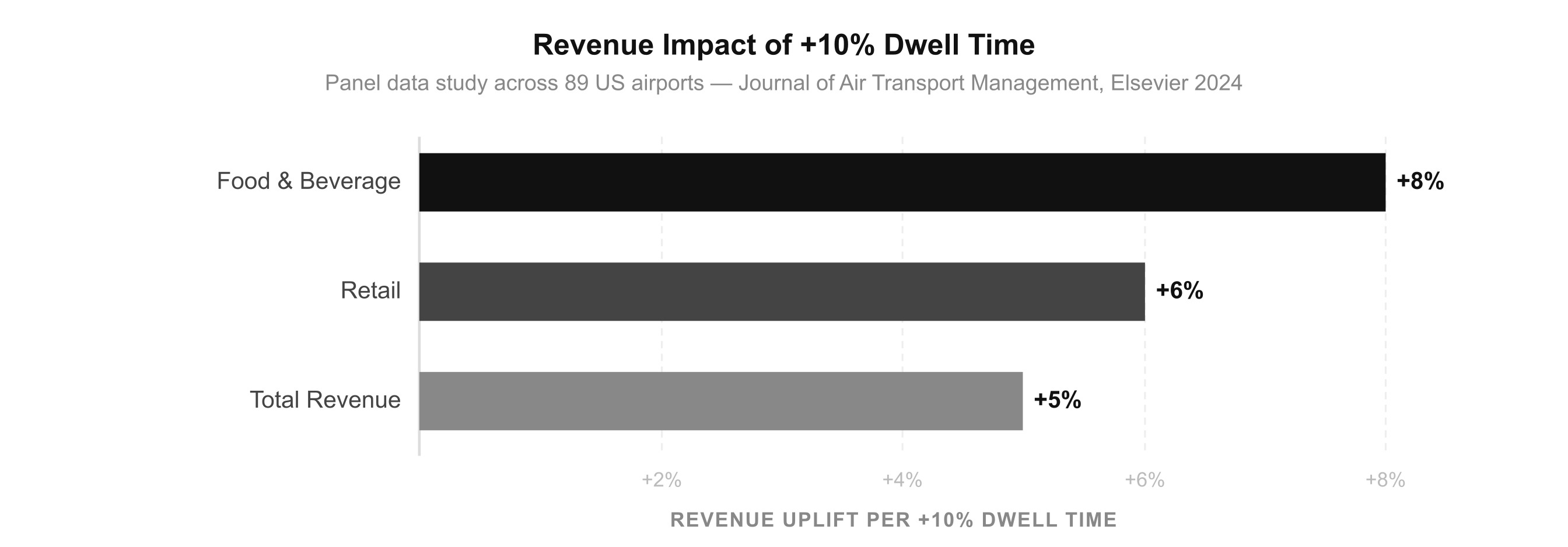
Panel data study across 89 US airports. Journal of Air Transport Management (Elsevier, 2024).
Non-aero revenue
+12.3%
After wait times fell below 15 minutes. Helsinki 2023.
Dwell time does not increase because a retailer ran a promotion. It increases because the UX reduced friction and built trust across every preceding touchpoint. Helsinki invested €1 billion in a program completed in autumn 2023, adding 3,000 m² of retail and opening 26 new commercial spaces. These are the direct return on a UX investment, expressed in square meters and revenue per passenger.
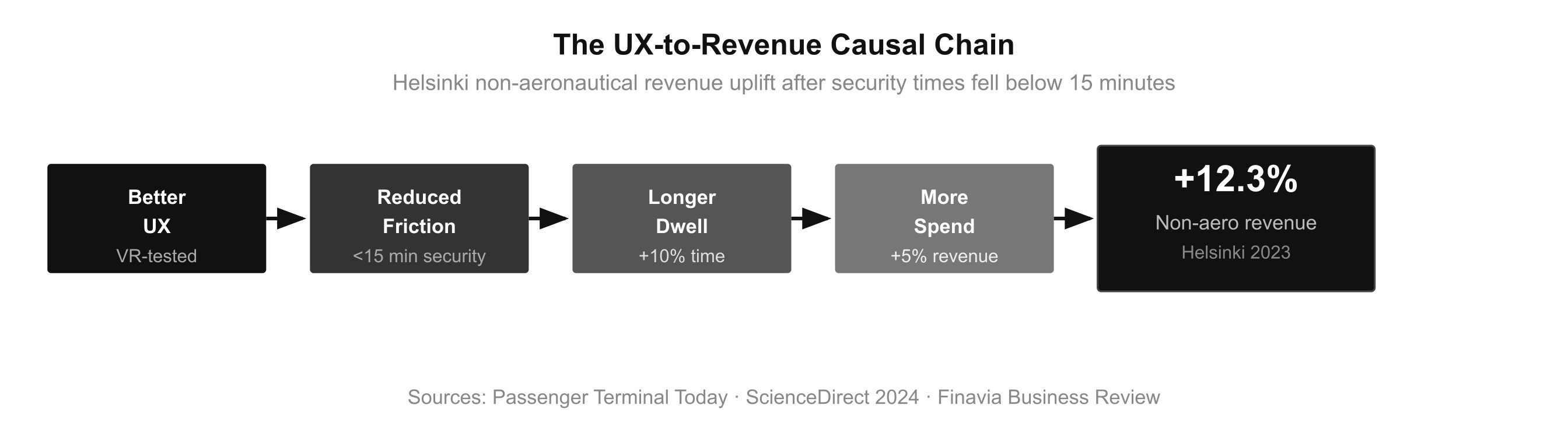
The causal chain: better UX → reduced friction → longer dwell → more commercial spend → +12.3% non-aeronautical revenue.
Three UX Principles Every Designer and CTO Can Apply
The Helsinki Case as a Transfer Model for Digital Product Teams
The Helsinki case is not replicable 1:1. But the principles behind it are. What Finavia built is the disciplined application of UX design thinking to a context most people would never think to apply it to. The same thinking transfers directly to digital product work, and the stakes in terms of revenue impact are just as real.
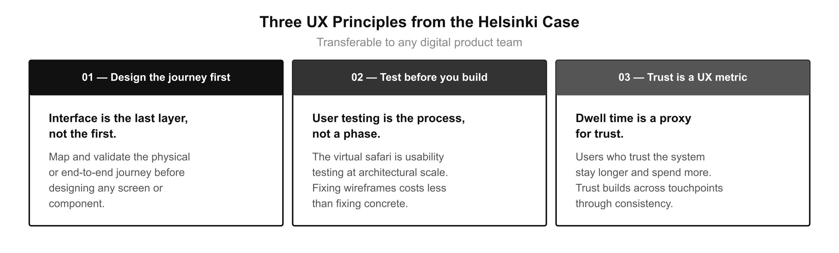
Three principles that transfer from airport design to any digital product context.
The Gap Between Infrastructure and Experience Is Measured in UX Decisions
Gamification as a Design Tool, Not a Consumer Feature
Helsinki Airport has been shown that the gap between an infrastructure and an experience is measured in UX decisions. Gamification was the tool that allowed those decisions to be tested at scale, before they became permanent. The virtual safari is user testing applied to concrete and steel. The result is a space that feels effortless, because every source of effort was identified and removed in advance.
The Helsinki Methodology: Key Takeaways
7×
Independent validation
Seven ASQ wins = seven annual rounds of 4,000-user research confirming design decisions work at industrial scale.
VR first
Fix in model, not concrete
Usability testing at architectural scale. Same principle as testing wireframes, applied to physical space before construction.
+12.3%
Revenue return on UX
Non-aeronautical revenue uplift after trust-driven dwell time increases. UX investment measured in commercial revenue, not satisfaction scores.
That is what good UX design does, at any scale, in any medium: it identifies every source of friction before users encounter it, and removes it before the cost of change becomes prohibitive. Helsinki just happened to do it with concrete and steel.
GAMIFICATION & VIRTUAL SAFARI METHODOLOGY Finavia Newsroom — "What do video games have to do with Helsinki Airport?" Primary source · First description of BIM + Unity gamification process (2018) https://www.finavia.fi/en/newsroom/2018/what-do-video-games-have-do-helsinki-airport-using-gamification-airport-development
Finavia Newsroom — "Virtual safaris help refine design details" Primary source · Virtual safari sessions, ORAT process, co-design methodology (2019) https://www.finavia.fi/en/newsroom/2019/virtual-safaris-help-refine-design-details-helsinki-airports-new-premises
Moodie Davitt Report — "Finavia unveils a virtual vision of the future" Specialist trade publication · Virtual safari description, stakeholder sessions https://moodiedavittreport.com/finavia-unveils-a-virtual-vision-of-the-future-at-helsinki-airport/
AEC Business — "How Helsinki Airport Uses BIM to Create the Best Customer Experience" Technical publication · CCTV positioning, escalator redesign, BIM outcomes https://aec-business.com/helsinki-airport-uses-bim-create-best-customer-experience/
Trimble / Tekla — Case study: "First-class construction" BIM software vendor case study · Solar glare, corridor widths, workstation repositioning https://www.tekla.com/resources/case-studies/first-class-construction-how-bim-data-brought-helsinki-airport-into-the-future
Taylor & Francis / Tandfonline — "From virtual reality to virtual safaris: new form of participatory design" Peer-reviewed academic study · University of Helsinki · 2024 https://www.tandfonline.com/doi/full/10.1080/15710882.2024.2378940
Future Travel Experience — SITA Lab and Helsinki Airport explore Microsoft HoloLens Specialist publication · Mixed reality in airport operations https://www.futuretravelexperience.com/2017/05/sita-lab-and-helsinki-airport-explore-potential-of-microsoft-hololens/
ECONOMIC IMPACT & NON-AERONAUTICAL REVENUE Passenger Terminal Today — "Boosting non-aeronautical revenues" Specialist publication · +12.3% revenue uplift, queue reduction data https://www.passengerterminaltoday.com/features/boosting-non-aeronautical-revenues.html
ScienceDirect — "Shopping or dining? On passenger dwell time and non-aeronautical revenues" Peer-reviewed · Journal of Air Transport Management (Elsevier, 2024) Panel data: 89 US airports · +10% dwell time → +5% revenue, +8% F&B, +6% retail https://www.sciencedirect.com/science/article/pii/S0969699724000851
ACI World Blog — "Maximizing Non-Aeronautical Revenues: Key to Airport Financial Sustainability" Institutional source · Airports Council International · Sector revenue trends https://blog.aci.aero/airport-economics/maximizing-non-aeronautical-revenues-key-to-airport-financial-sustainability/
Airport Industry Review — "How has airport gaming shifted?" Specialist publication · November 2024 · Gaming and dwell time correlation https://airport.nridigital.com/air_nov24/how_has_airport_gaming_shifted
Finavia — "Commentary: groundbreaking commercial spatial design and customer insight" Primary source · 29,000 m² retail, 26 new spaces, €1 billion expansion (2023) https://www.finavia.fi/en/newsroom/2023/commentary-groundbreaking-commercial-spatial-design-and-customer-insight-used