What Airlines Can Learn from Video Games
- The Cost of Standing Still
- The Game Design Principle: What Designers Figured Out in 1998
- 1. Dead Space: Diegetic UI
- 2. Mirror's Edge: Environmental Wayfinding
- 3. Dark Souls: The Stress Curve
- 4. Progress Mechanics: Visible Status
- 5. Alien: Isolation: Progressive Disclosure
- 6. The Egocentric Minimap: Spatial Navigation
- 7. The Quest Structure: Sequencing
- 8. Dynamic Difficulty Adjustment: Adaptive AI
- The Business Case: One Airport That Already Did This
- Who Moves First Wins the Next Decade of Passenger Loyalty
- The techniques are thirty years old. The opportunity is now.
What Airlines Can Learn From Video Game UX
Airlines lose billions to bad interface design during high-stress disruptions. Explore 8 proven video game UX mechanics that solve cognitive overload and streamline the modern passenger journey.
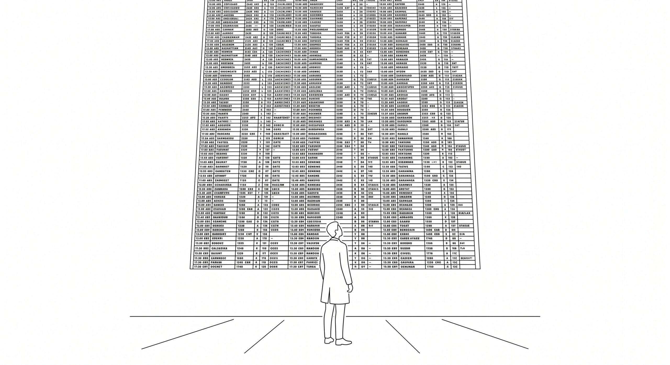
Games solved high-stress, high-cognitive-load interface design three decades ago. Airlines are still using the same screen layout they deployed in 2003. Here is the business case for changing that, and eight specific places to start.
Airlines lose an estimated $35 billion a year to flight delays. A single delayed departure costs between $10,000 and $15,000 in direct operational expenses, gate agent overtime, aircraft rotation disruption, and passenger compensation obligations under EC 261/2004. Approximately one in four ATFM delay minutes in European airspace originates from turnaround-related failures. Most of those failures are not technical. They are informational.
The modern airport terminal is a landscape engineered for database efficiency rather than human cognition. A passenger navigating an unfamiliar terminal while simultaneously decoding a mobile app is performing continuous visual saccades and cognitive context-switching. Under those conditions, every additional option on the screen is not information. It is friction. And friction, in aviation, costs money.
Games solved this problem between 1998 and 2014. Specifically, game designers working under the absolute constraint of player immersion developed a principle called diegetic interface design, building all status, navigation, and progress information directly into the game environment rather than overlaying it on the screen. It worked so well that it became the gold standard of game UX. No airline has applied it.
The Financial Case for Change
$35B
Annual revenue lost to delays
88%
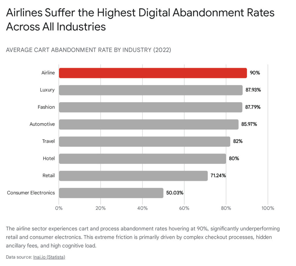
Check-in abandonment rate
€48K
Max call centre cost per disruption event
The Cost of Standing Still
Bad design is not an aesthetic problem in aviation. It is an operational one. The abandoned online check-in that sends a passenger to the desk costs approximately €14 in additional agent handling per interaction. At scale, airlines with above-average check-in abandonment spend tens of millions annually on avoidable counter transactions.
Disruption notifications are the most expensive single point of failure. When a flight cancels, legacy systems present passengers with six simultaneous options: rebook, refund, hotel voucher, meal voucher, insurance claim, customer service number. Each option requires a distinct cognitive pathway. At the precise moment of maximum passenger stress, the system maximises cognitive load. The result is guaranteed operational collapse: a single disruption event at a major hub reliably generates 4,000 inbound calls within 45 minutes, costing EUR 32,000-48,000 per event, before a single euro of EC 261/2004 compensation is calculated.
The Game Design Principle: What Designers Figured Out in 1998
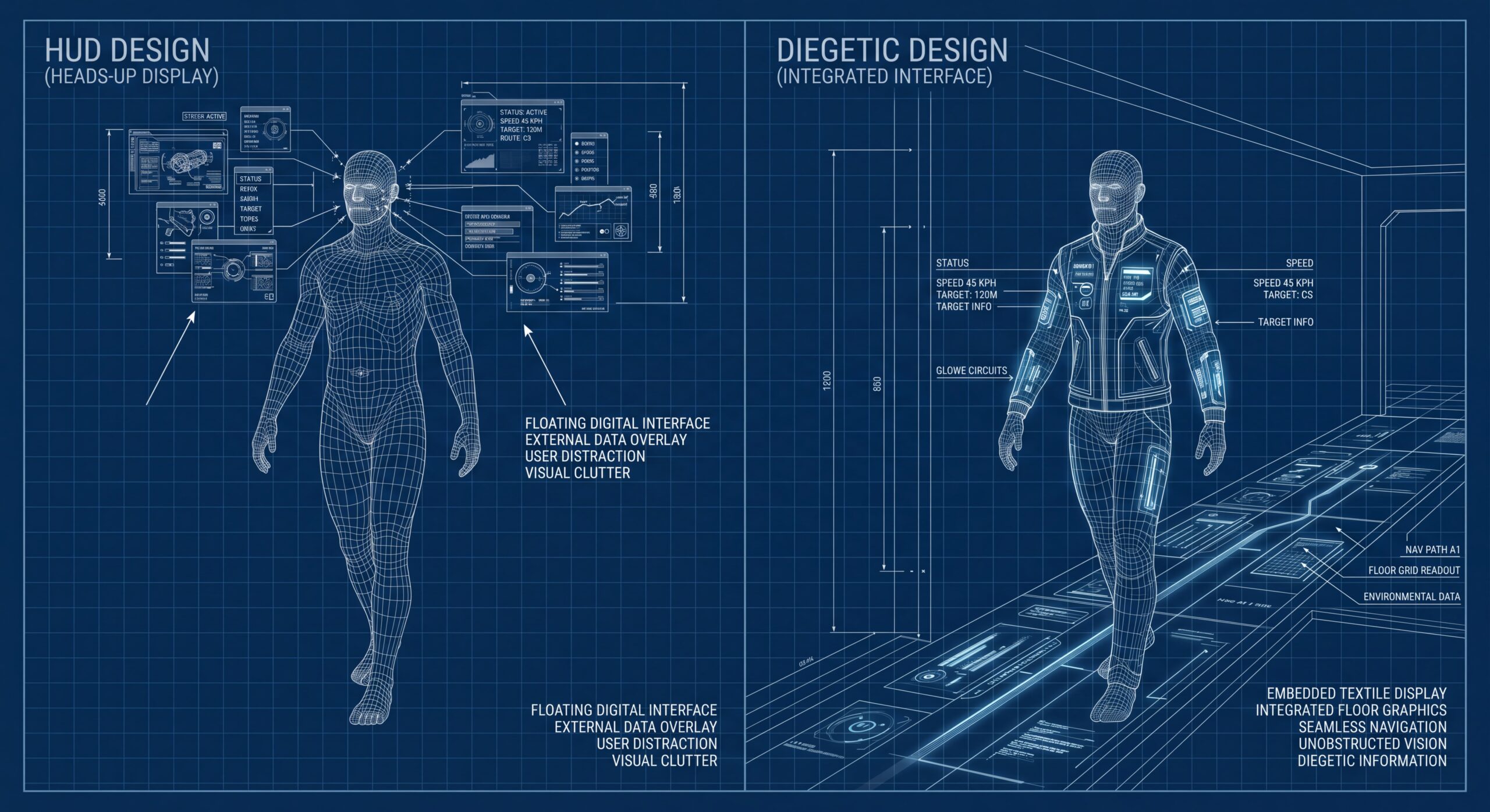
Diegetic interface design is the practice of placing all functional information, including health, navigation, objectives, and progress, inside the game world rather than floating it on top of the screen as a heads-up display. The player character knows their own health because the suit glows. The player knows which direction to walk because there's a light on the floor. The world tells you where to go without making you look away from the space you're already in.
The principle produces two things simultaneously: reduced cognitive load and higher immersion. Both are directly valuable in aviation. A passenger navigating an unfamiliar terminal has the same needs as a player navigating an unfamiliar level: clear directional cues, visible progress, and status information that doesn't require stopping to process. The following eight games each solved a different piece of this problem. Each solution translates directly to an airport or airline context.
"The airport is the most cognitively demanding environment most people enter in their civilian lives. Games have been designing for exactly that environment for three decades. No airline has looked."
1. Dead Space: Diegetic UI
EA Redwood Shores, 2008
Dead Space shipped with a health system that put every piece of critical information onto engineer Isaac Clarke's suit, not the screen. His health was displayed via LED segments on his spine: aqua-blue at full health, shifting to warning yellow, then flashing red at critical. Ammunition was projected as a holographic count directly onto each weapon. There was no health bar in a corner, no minimap, no floating objective marker. The game world carried all of it. The design team made this choice under one constraint: zero interface elements could break immersion. What they produced was one of the most studied UX designs in game history.
Transplant
2. Mirror's Edge: Environmental Wayfinding
DICE / EA, 2008
Mirror's Edge introduced Runner Vision, a system where every surface the player should interact with was coloured red against an otherwise white or grey environment. There were no waypoints, no arrows, no objective markers. The path was encoded into the colour of the world itself. Players learned within minutes to follow the red without consciously thinking about it. Use environmental colour as a navigational signal rather than a screen overlay. The world tells you where to go. Your eyes don't have to leave the space you're in to receive the instruction.
Transplant
3. Dark Souls: The Stress Curve
FromSoftware, 2011
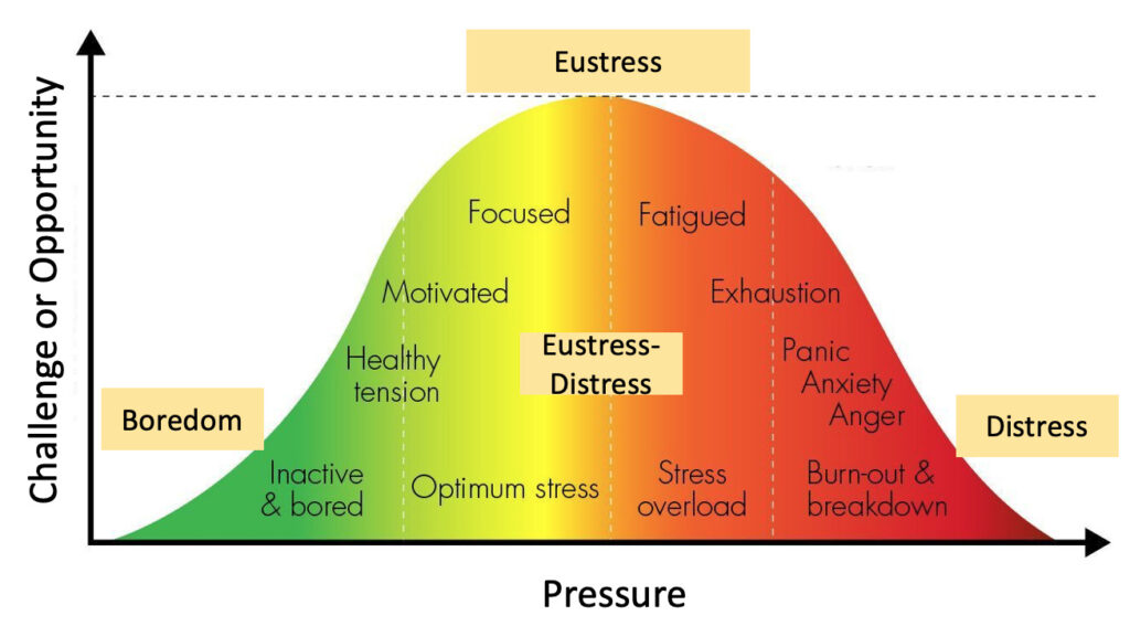
Dark Souls is the hardest major game franchise of the last 20 years, and paradoxically one of the best-designed for managing player stress. Every hard section is preceded by a bonfire: a safe zone where the player can rest, resupply, and receive any information they need. Critical communication happens at the bonfire. Never mid-boss. The Yerkes-Dodson Law holds that humans have an optimal arousal level for engagement. Sustain the stress spike too long without a recovery window and it shifts from exciting to exhausting. Left 4 Dead's AI Director applied this formally, tracking player stress in real time and mathematically generating peaks and valleys accordingly.

Transplant
"The Yerkes-Dodson Law has been in the psychology literature since 1908. Left 4 Dead's AI Director was applying it to player stress management in 2008. In 2026, the average airline cancellation notification still presents six simultaneous options to a passenger in crisis." , Crafton, Aviation UX Research, 2026
4. Progress Mechanics: Visible Status
Every major game since 1995
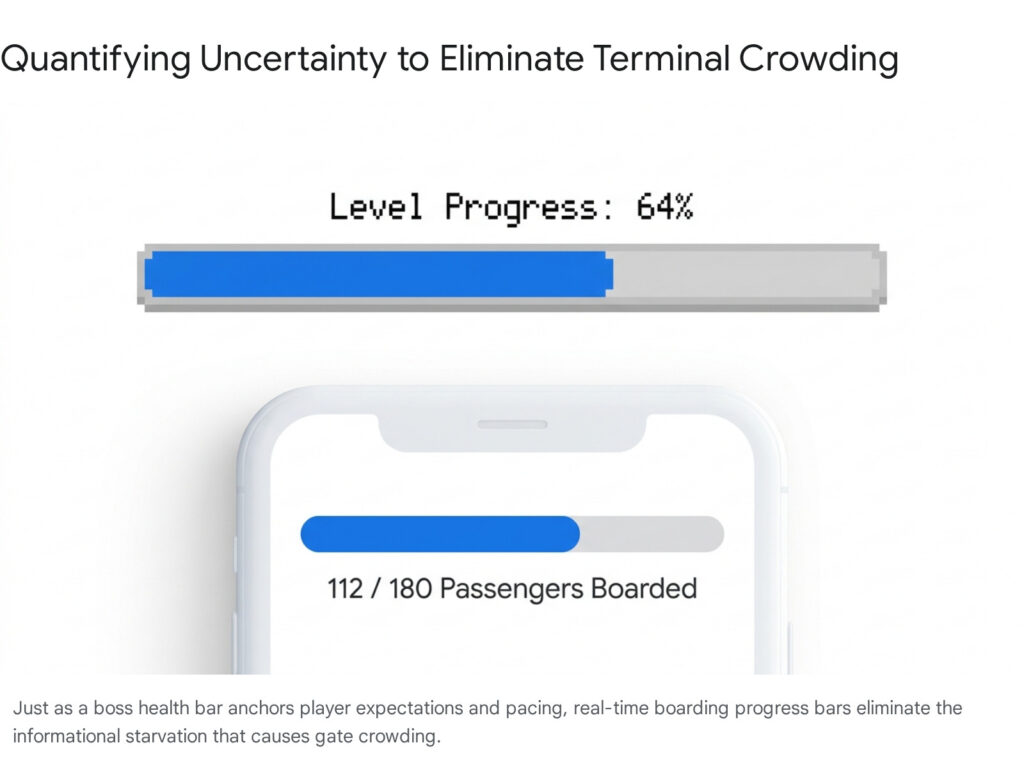
Every game since the mid-1990s shows players exactly where they are in the experience: chapter progress, level completion, boss health bars. The underlying insight is psychological: uncertainty produces anxiety, and anxiety produces irrational behaviour. Players who know they are 60% through a level behave differently than players who have no idea how far the end is. They plan. They pace themselves. They stop doing the equivalent of rushing the gate. LinkedIn's profile completion indicator, a single progress bar, increased profile completeness by 55%. The mechanism is identical regardless of context.
Transplant
5. Alien: Isolation: Progressive Disclosure
Creative Assembly / SEGA, 2014
Alien: Isolation is a masterclass in information economy. The motion tracker, the player's only navigational tool, shows one signal: movement. It doesn't show the layout of the ship. It doesn't show objectives. It doesn't display enemy health or room contents. It shows only what the player needs to know at this exact moment: is something near me, and which direction? The interface has a clear design mandate: surface exactly the information that enables the current decision. Nothing more.

Transplant
6. The Egocentric Minimap: Spatial Navigation
Halo · GTA · Zelda · Open-World Standard
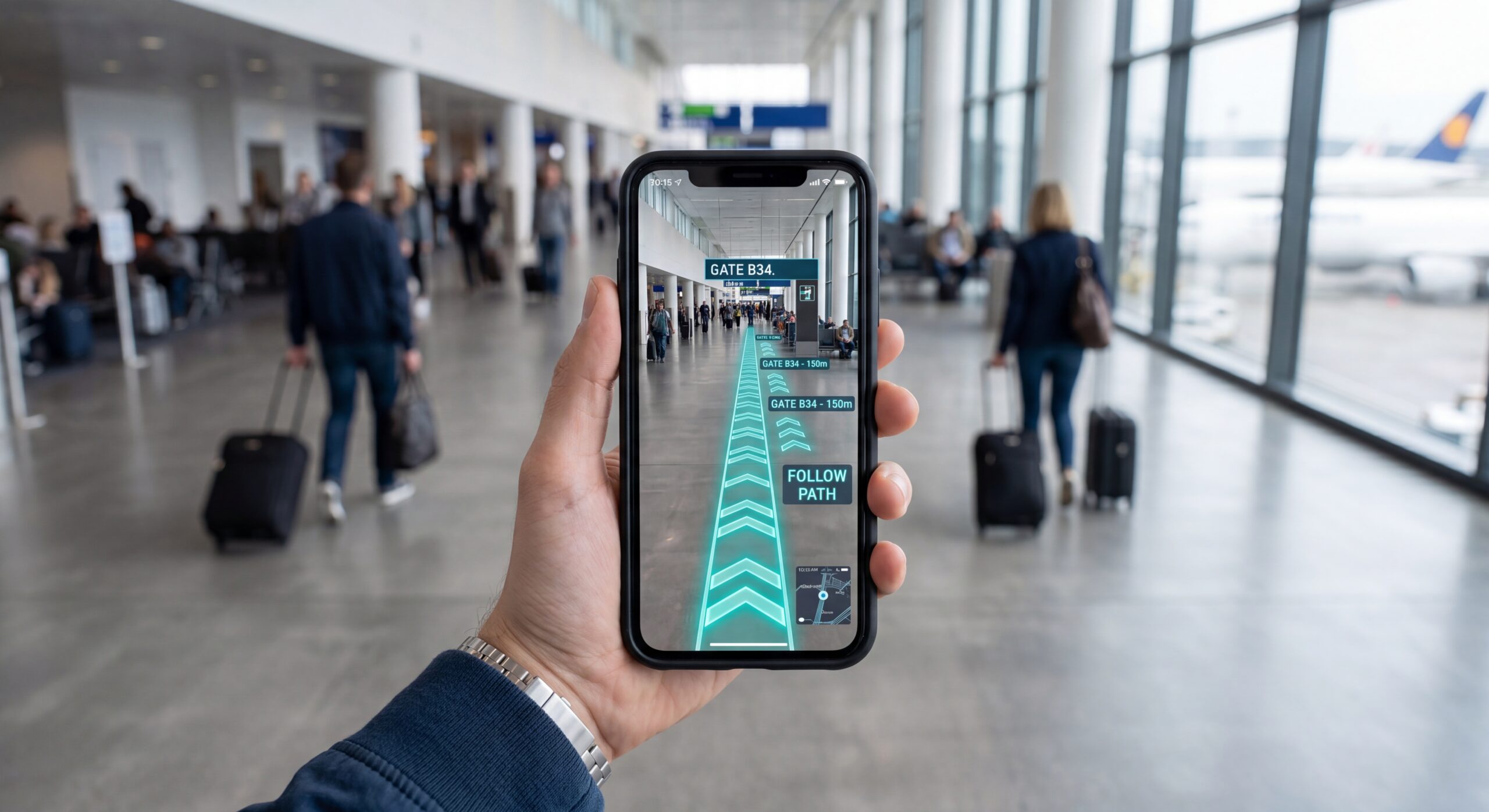
Every open-world game uses a heading-up minimap: the player is always at the centre, always facing up, and the map rotates around them as they move. This eliminates an entire category of cognitive error. The player never has to mentally rotate the map to match their physical body orientation because the map already matches it. Research in spatial cognition confirms the mechanism: allocentric (north-up) navigation requires the brain to perform an explicit translation step that imposes measurable working memory load. Egocentric navigation bypasses this entirely. Google Maps switched to heading-up by default for walking navigation because the behavioural data showed it reduced navigation errors. No airport wayfinding app has made the same switch.
Transplant
7. The Quest Structure: Sequencing
The Witcher · Mass Effect · Elden Ring · Every RPG Ever Made
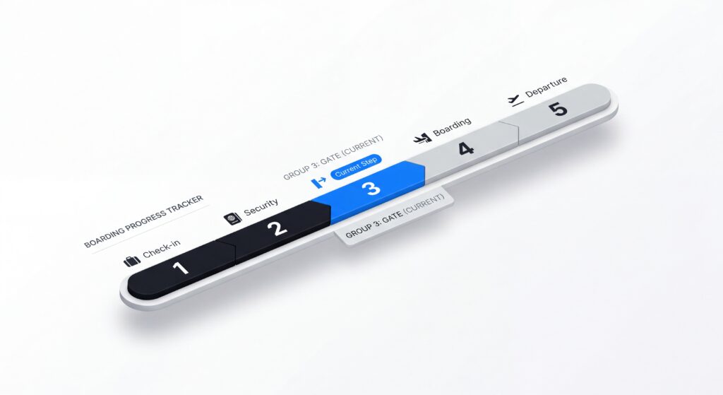
Every RPG surfaces one active objective, not the full quest log. Here is the next door. Walk through it, and the next one opens. The full narrative arc is in the engine; the UI surfaces only the immediate instruction. Nielsen Norman Group research on progressive disclosure confirms that multi-step implementations of any flow show 14-300% higher completion rates than equivalent single-page information dumps, because perceived task complexity drops at each decision point.
Transplant
8. Dynamic Difficulty Adjustment: Adaptive AI
Resident Evil 4 · Left 4 Dead · EA Sports · Mainstream since 2004
Dynamic Difficulty Adjustment (DDA) systems continuously monitor performance signals and silently adjust the experience to keep the user in their optimal engagement zone. Formalised in Robin Hunicke and Vernell Chapman's 2004 paper and grounded theoretically by Jenova Chen's USC thesis applying Csikszentmihalyi's Flow theory to interactive design, DDA monitors health level, death rate, item usage, movement speed, and backtracking frequency, then reduces load when the player is depleted and increases it when they've recovered. The player never sees the mechanism. They feel, inexplicably, that the game is always exactly hard enough.
Transplant
The Business Case: One Airport That Already Did This
Singapore Changi Airport is the most cited case study in aviation experience design. The Jewel complex, a 134,000 square metre experience-first passenger facility, was built on the explicit premise that passenger experience drives non-aeronautical revenue. In 2024, Jewel reported over 80 million visitors, foot traffic up 10% year-on-year, sales up 5%, and retail sales per square foot up 6% versus 2023. Changi Group generates over 40% of its total revenues from concessions and retail income, not from runway operations. The strategic premise is now industry consensus: airports that invest in the passenger experience layer generate non-aeronautical revenue that outperforms the aeronautical core.
| Intervention | Cost | Measurable Return |
|---|---|---|
| Single-action disruption notification | Front-end only | €32K-48K saved per disruption event in call centre volume |
| Progressive check-in flow | Front-end redesign | Measurable lift in completion rate + ancillary revenue per session |
| Heading-up airport map | One rendering parameter | Reduced navigation errors; reduced call centre wayfinding queries |
| Gate FIDS boarding progress | Data already exists | Gate crowd reduction; reduced boarding time; improved OTP |
| LED diegetic floor wayfinding | Infrastructure | Changi Terminal 1: measurable throughput improvement post-2022 |
Who Moves First Wins the Next Decade of Passenger Loyalty
When routes, prices, and seat configurations are effectively commoditised, the differentiator becomes how an airline treats passengers in the moments that matter most: the check-in flow, the disruption notification, the boarding gate. These are not design problems. They are retention problems. A passenger who navigates a cancellation through a single-action interface and lands on an alternative flight in three taps has a materially different loyalty outcome than one who spent forty minutes on hold because the notification overwhelmed them with six options at once.
The financial case is equally clear. Forrester Research's $100 return per $1 of UX investment is the headline figure. Design-led companies have historically outperformed the S&P 500 by over 200% across a ten-year horizon. The eight transplants in this article are not speculative. Dead Space shipped in 2008. Mirror's Edge shipped in 2008. Dark Souls shipped in 2011. Jenova Chen's Flow thesis was published in 2006. The evidence is in the hands of hundreds of millions of players who completed entire games guided only by environmental cues and progressive information disclosure.
The techniques work. The question is only whether your product team applies them before a competitor does.
The techniques are thirty years old. The opportunity is now.
Game designers solved cognitive load under high-stress conditions across decades of playtesting and measurable engagement data. The psychological mechanisms, including diegetic wayfinding, stress curve management, progressive disclosure, and adaptive interfaces, are not theoretical. They are in the hands of hundreds of millions of players who completed entire games guided only by environmental cues.
Airlines have the same data. They have the same backend infrastructure. What they are missing is the design decision to apply what already works.
Crafton works with aviation and airport operators on the UX and interface architecture layer, from disruption notification flows to terminal wayfinding systems. Start a conversation →
Designing Effective Diegetic UI — Jaiwanthshan / Medium https://medium.com/@jaiwanth/designing-effective-diegetic-ui
Diegesis and Designing for Immersion — Game Developer https://www.gamedeveloper.com/design/diegesis-and-designing-for-immersion
Diegesis and Designing for Immersion — Game Developer https://www.gamedeveloper.com/design/diegesis-and-designing-for-immersion
Why Airlines Have the Highest Cart Abandonment Rate — Inai.io https://www.inai.io/blog/why-airlines-have-the-highest-cart-abandonment-rate
Per-Minute Cost of Delays to US Airlines — Airlines for America https://www.airlines.org/dataset/per-minute-cost-of-delays-to-u-s-airlines/
CODA Digest Annual 2023 — EUROCONTROL https://www.eurocontrol.int/publication/coda-digest-annual-2023
The Business Impact of UX — Hypersense Software https://hypersense-software.com/blog/2021/03/22/business-impact-ux/
Shortening Airline Boarding Processes — The Decision Lab https://thedecisionlab.com/insights/transportation/shortening-airline-boarding-processes
Jewel Changi Airport Record Footfall and Sales — Changi Airport Group https://www.changiairport.com/en/discover/news-and-updates/jewel-changi-airport-achieves-record-footfall-and-sales-in-2024.html
ChangiVerse Case Study — Accenture https://www.accenture.com/us-en/case-studies/travel/changiverse
From RPGs to UX: Progress Indicators and User Engagement — UX Collective https://uxdesign.cc/from-rpgs-to-ux-what-progress-indicators-can-teach-us-about-user-engagement
Mirror's Edge, UX is not UI — Gur-u https://www.gur-u.com/mirrors-edge-ux-is-not-ui/
AI for Dynamic Difficulty Adjustment in Games — Hunicke & Chapman, AAAI 2004 https://www.aaai.org/Library/Workshops/2004/ws04-04-012.php
Flow in Games — Jenova Chen, USC MFA Thesis, 2006 https://jenovachen.com/flowingames/flowingames.htm
Dynamic Difficulty Adjustment in Games — IntechOpen https://www.intechopen.com/chapters/dynamic-difficulty-adjustment
Progressive Disclosure — Nielsen Norman Group https://www.nngroup.com/articles/progressive-disclosure/
Multi-Step vs. Single-Page Forms — Numinam, 2026 https://www.numinam.com/multi-step-vs-single-page-forms
Egocentric vs. Allocentric Cognitive Maps — PMC / National Library of Medicine, 2023 https://pmc.ncbi.nlm.nih.gov/articles/egocentric-allocentric-navigation-2023
Human Orientation and Wayfinding in Airport Passenger Terminals — TRB, 1991 https://onlinepubs.trb.org/onlinepubs/tcrp/tcrp_rpt_052-a.pdf
Airport Wayfinding Systems — Mappedin https://www.mappedin.com/blog/airport-wayfinding/