The $0 Fix That Would Stop Passengers Running for Their Gate
- The Wrong Number Has Been on That Board for Decades
- Why Departure Time Is the Wrong Unit of Information
- What Progressive Disclosure Looks Like at Gate Level
- One Principle. One Field. Eliminating Four Unknowns.
- The $0 Fix: Why It Has Not Happened Yet
- The Evidence Is Already In
- King's Cross, 2025: The Same Principle Tested in a Different Terminal
- The Final Verdict
- A Configuration Decision Dressed Up as an Infrastructure Problem
The $0 Departure Board Fix That Changes Passenger Behaviour
Departure boards display scheduled departure time: a number that tells passengers when the aircraft leaves, not when they must act. Switching the primary display to „Gate Closes in X minutes” applies one of interaction design’s most validated principles to a high-stakes physical environment.
TL;DR
Departure boards display scheduled departure time: a number that tells passengers when the aircraft leaves, not when they must act. Switching the primary display to "Gate Closes in X minutes" applies one of interaction design's most validated principles to a high-stakes physical environment. The change requires no new hardware or data integration. Only a configuration decision on existing flight information display systems. At zero cost, it has a direct claim on terminal sprint injuries, pushback delays, and the systemic anxiety that defines the modern departure experience.
Information design shapes behaviour in high-stakes environments. The departure board is a behavioural interface. What it displays determines how passengers act. And right now, it is displaying the wrong data.
01
The Wrong Number Has Been on That Board for Decades
Picture a passenger in the departure lounge, thirty minutes before a 14:30 flight. There is time for a coffee. Then someone near the gate stands up. Bags are thrown over shoulders. Within seconds, a dozen people are moving. By 14:05, a third of the lounge is walking fast, some jogging. No announcement has been made. No one knows whether boarding has started. Everyone has decided that being wrong is too expensive to risk.
This is not poor time management. It is a rational response to ambiguous information. The departure board showed 14:30. No one in that lounge knew whether the gate would close at 14:10, 14:15, or 14:20. So they responded to the only available signal: social movement. The board did not cause the sprint directly. It created the ambiguity that made the sprint inevitable.
02
Why Departure Time Is the Wrong Unit of Information
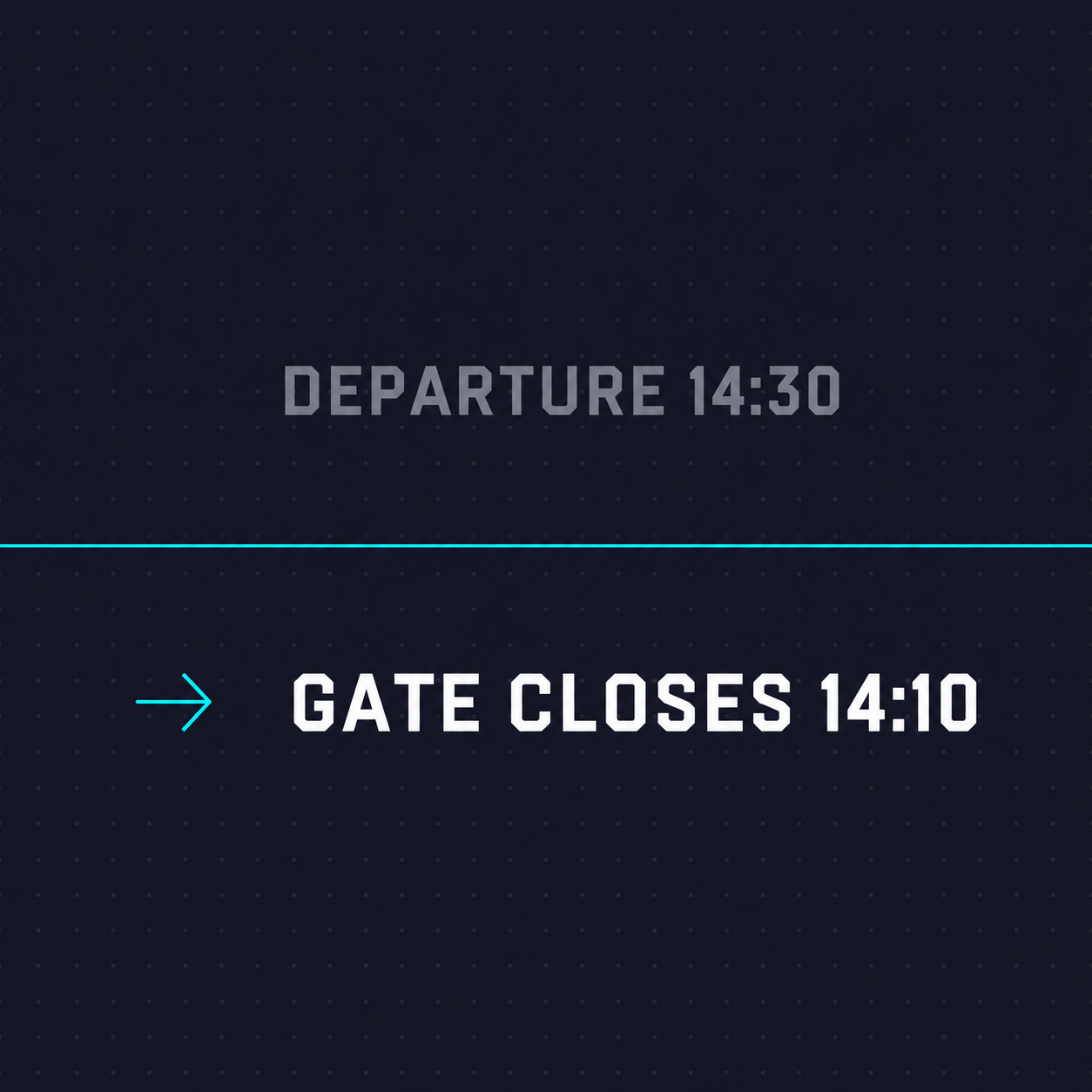
Scheduled departure time is context-dependent. To use it correctly, a passenger must know their carrier's gate-close policy, which varies from 10 to 60 minutes before departure with no universal standard across airlines, airports, or route types. They must know the walking time to their specific gate. They must know whether "Go to gate" is a genuine instruction or a holding message. They are being asked to interpret one number against four unknowns.
The result is a known pattern in passenger behaviour: passengers delay movement until visual social cues override the ambiguity, then accelerate sharply. The last-minute sprint is not an irrational behaviour. It is the predictable output of a display system optimised for operational record-keeping rather than passenger decision-making.
The cost is operational. Late-arriving passengers are among the most common causes of pushback delays, and pushback delays cascade through slot management at costs airlines measure in millions annually. The human cost is less visible: running in terminals, particularly with luggage, is a leading cause of slip-and-fall injuries in transit environments.
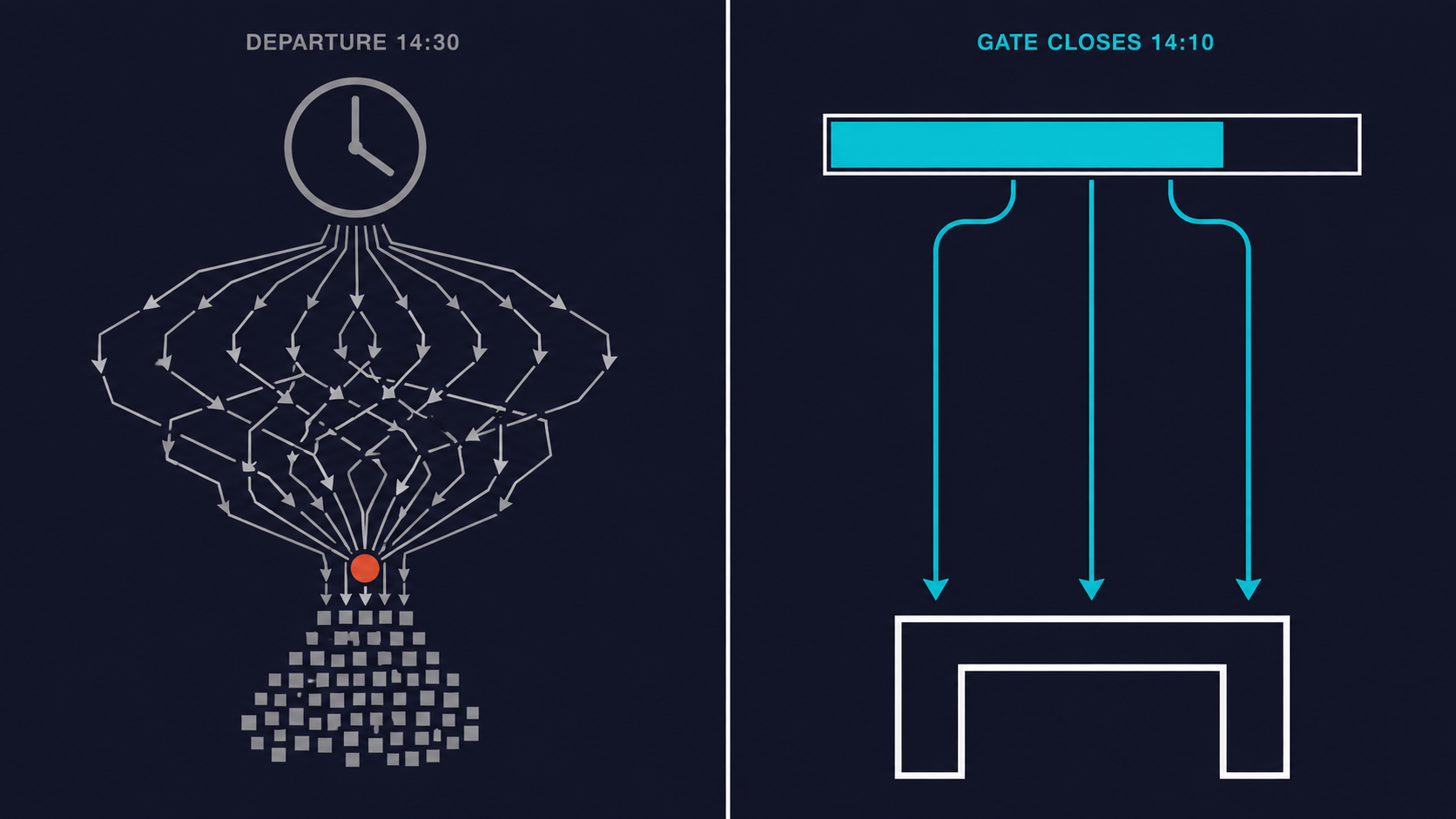
Left: one ambiguous number, unpredictable movement, social contagion sprint. Right: one clear deadline, distributed movement, no sprint.
03
What Progressive Disclosure Looks Like at Gate Level
One Principle. One Field. Eliminating Four Unknowns.
Progressive disclosure is a foundational principle of interaction design: present to the user only the information they need to act in this specific moment. Earlier in the journey, a passenger needs context — terminal, gate, status. As departure approaches, context becomes noise. The single piece of information the passenger needs is how much time remains before the decision becomes irreversible.
"Gate Closes in 15 min" eliminates all four unknowns at once. It communicates the moment after which no action is effective. That is the only moment that matters, and it is the moment the current display system obscures.
Some airlines have already applied this logic at the boarding pass level. In 2015, TravelMole reported carriers replacing scheduled departure time on boarding passes with two fields: boarding-begin and gate-close time. EasyJet boarding passes now display gate-close time prominently. What those carriers applied to individual documents, airports have not applied to the shared display that reaches every passenger simultaneously.
04
The $0 Fix: Why It Has Not Happened Yet
Every flight information display system in commercial operation already contains the data required. Gate-close time is a derived value: scheduled departure minus the airline's standard offset. That calculation runs inside every flight management system as a matter of operational record. It is not a new data source. It is an existing field that is not currently surfaced as the primary display value.
Changing the display requires a configuration decision, not a capital project. No new hardware. No new integration. No new data pipeline. The barrier is not technical. It is a choice about information hierarchy that has not yet been made at the terminal level, despite having been made in parallel by individual carriers on individual boarding passes.
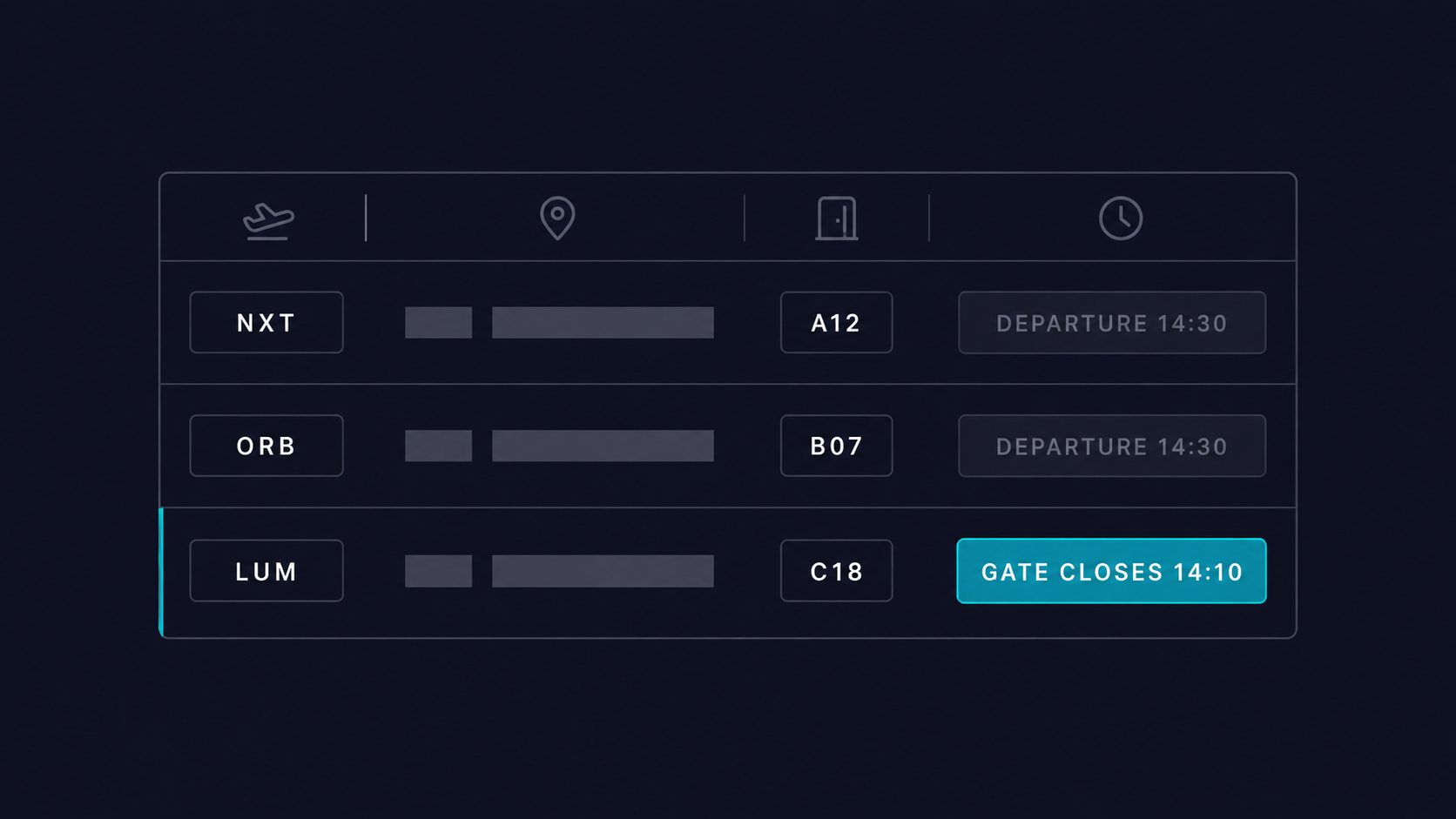
The existing display (top rows) versus the proposed change (highlighted row). Same data source. Different field. Zero infrastructure cost.
05
The Evidence Is Already In
King's Cross, 2025: The Same Principle Tested in a Different Terminal
In 2025, Network Rail initiated a trial at London's King's Cross station: long-distance trains were removed from departure boards three minutes before their scheduled departure. The stated rationale was safety. Running at stations is one of the highest injury risks for passengers, particularly with luggage, and the departure board was functioning as the visual trigger for that behaviour. By removing the temporal anchor once the boarding window closes, the trial aimed to prevent the last-minute sprint and improve punctuality by removing the behavioural incentive to hold trains for late runners.
The mechanism is the same as the departure board intervention proposed here. Change what information is displayed, and at what moment it is removed, and you change the behaviour the display produces. The airport context involves more variables than a train station, but the core dynamic is identical: a display system optimised for one purpose is producing an unintended behavioural outcome. Correcting the display resolves the behaviour without touching any other system. The Changi Airport UX case makes the same argument at infrastructure scale: the most consequential design decisions are often the ones nobody photographs.
06
The Final Verdict
A Configuration Decision Dressed Up as an Infrastructure Problem
The departure board has not been redesigned because it works, in the sense that it conveys information. But "conveys information" and "produces the right behaviour" are not the same objective, and the gap between them is measurable in terminal injuries, pushback delays, and the ambient anxiety that defines the air travel experience for a significant share of passengers.
Displaying time-to-gate-close is progressive disclosure applied to the most consequential shared display in the terminal. It removes ambiguity at exactly the moment ambiguity becomes most costly. It requires no infrastructure investment, no vendor contract, and no multi-year procurement cycle. It requires a decision about which data field to surface on a screen that already exists. For airport operators reviewing passenger experience initiatives at a terminal level: this is the quick win that validates the principle before the capital expenditure conversation begins.
Work with Crafton
Crafton works with airports and transport operators to redesign digital touchpoints across the terminal journey, from wayfinding systems to departure information architecture. If you are evaluating where UX-level decisions produce measurable operational outcomes, we can map those points against your environment.
Final-boarding rule — the random airline 10-minute rule. https://www.travelersunited.org/final-boarding-the-all-important-and-random-airline-10-minute-rule/ WAtoday. (2021, May 24). The ALP and the uncomfortable nothingness of waiting at the departure gate.
Final frontier for departure times on boarding passes. https://www.travelmole.com/news/final-frontier-for-departure-times-on-boarding-passes/ Travelers United. (2026, March 16).
Explained: Why you can't board a flight after the gate closes. https://simpleflying.com/why-you-cant-board-flights-after-gates-close/ TravelMole. (2015, June 10).
Why airlines close boarding gates 20 minutes before departure? 5 real reasons behind the rule. https://www.ndtv.com/travel/why-airlines-close-boarding-gates-20-minutes-before-departure-5-real-reasons-behind-the-rule-9502737 Simple Flying. (2024, June 30).
Business Traveller. (2026, April 23). EasyJet conformance at Gatwick. https://www.businesstraveller.com/forums/topic/easyjet-conformance-at-gatwick/ DBpedia. (n.d.). Progressive disclosure. https://dbpedia.org/page/Progressive_disclosure NDTV. (2025, October 22).

Marketing, new business